
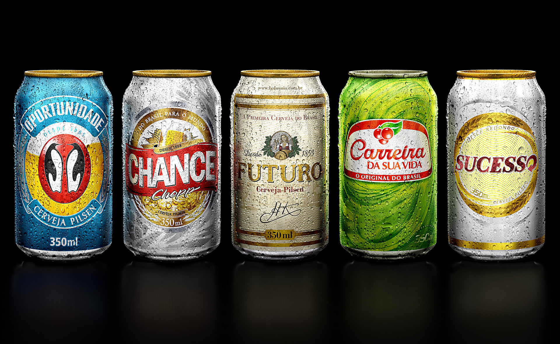
Ambev campaign
Ilustração criada para endomarketing Ambev.
Illustration created to the Ambev endomarketing.
Cliente | client: Ambev
Agência | agency: MPM
Diretor de arte | art director: Marcelo Anache
Estúdio | studio: Quad studio
Ilustrador | illustrator: João Ferraz | Lucio Libanori
Ilustração criada para endomarketing Ambev.
Illustration created to the Ambev endomarketing.
Cliente | client: Ambev
Agência | agency: MPM
Diretor de arte | art director: Marcelo Anache
Estúdio | studio: Quad studio
Ilustrador | illustrator: João Ferraz | Lucio Libanori
Todas as latas foram desenhadas individualmente.
Esta montagem com todas foi somente para fins de portfólio mas cada lata tem 1 metro de altura a 300 dpi!
All cans were individually designed.
This assembly with all was only for portfolio purposes but each can has 1 meter high at 300 dpi!


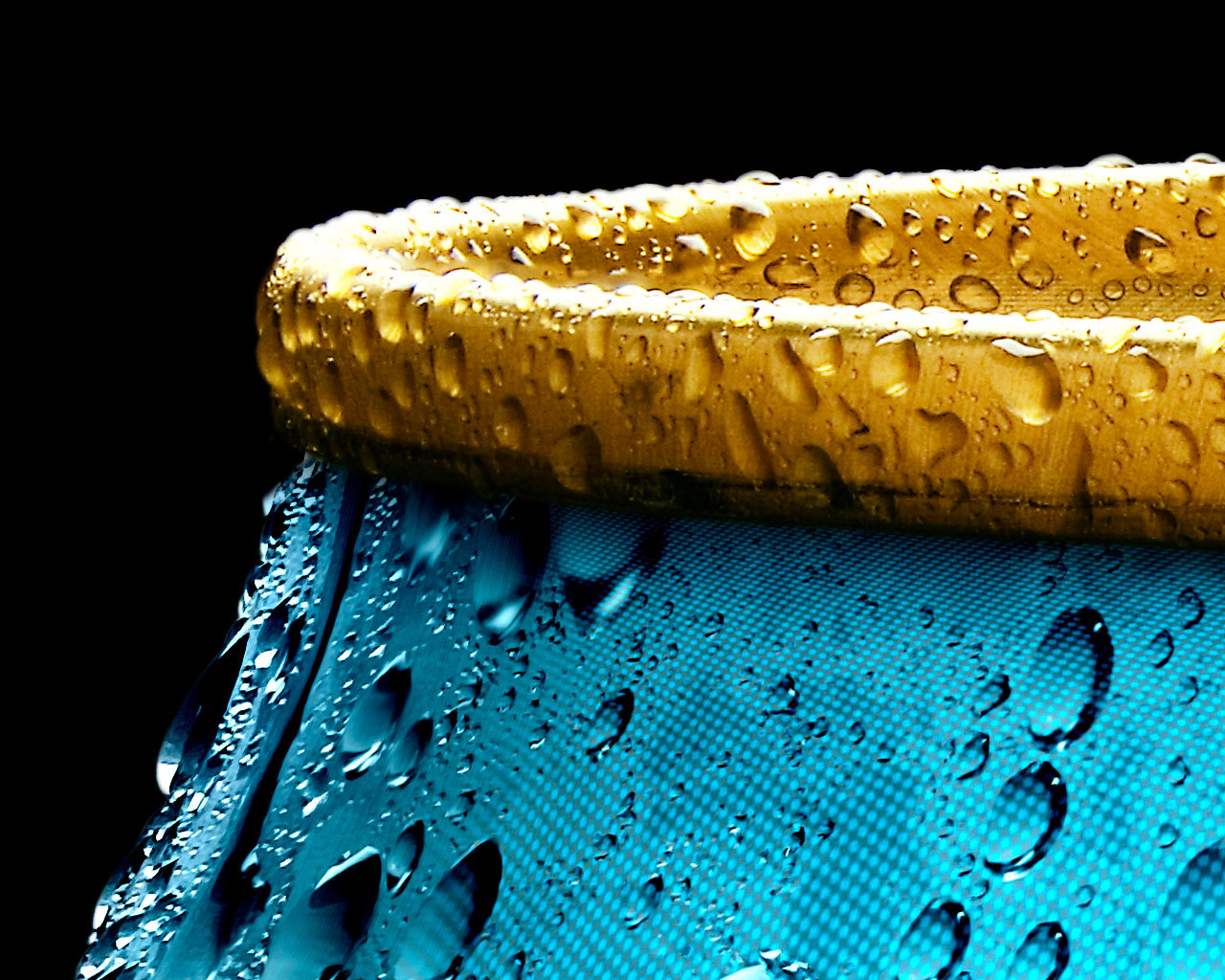

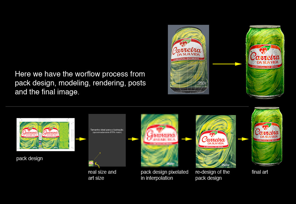
Aqui acima nós temos o render puro tirado no Modo e a arte final tratada no Photoshop.
Este projeto era tão complexo e pesado para renderizar que tivemos mais trabalho no processo de tratamento e re-design de rótulos do que de fato no ambiente em 3D.
Here above we have the pure rendering done in Modo and the artwork treated in Photoshop.
This project was so complex and cumbersome to render that we had more work in the post process and re-design of the labels than that done in the 3D environment.
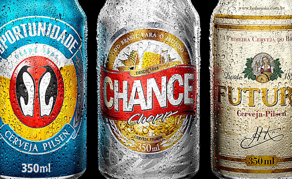
O grande desafio foi:
1) A imagem final tinha 1 metro a 300 dpi, em pixels isso dá praticamente 11.000 x 13.0000 pixels!!!
2) Por conta do enorme tamanho e pouco tempo para entregar a arte decidimos fazer as gotas por meio do Photoshop. O Lucio Libanori tirou várias fotos em alta definição e re-desenhou gota a gota no Photoshop!
Para cada lata, as gotas foram diferentes a não ser nas laterais, topo e na parte de baixo.
Para cada lata, as gotas foram diferentes a não ser nas laterais, topo e na parte de baixo.
Por quê? Porque todas as latas teriam uma faca especial e desta forma manter as gotas iguais aproveitaria a mesma faca gráfica diminuindo também o orçamento em geral e o custo com produção gráfica.
É por isso que não há também, gotinhas no chão, raspinhas de gelo e outras cositas mas...
Para todas as latas tivemos em torno de 5 dias, este prazo é muito apertado e bem estressante daí tivemos de encontrar soluções rápidas e que ficassem com uma boa qualidade.
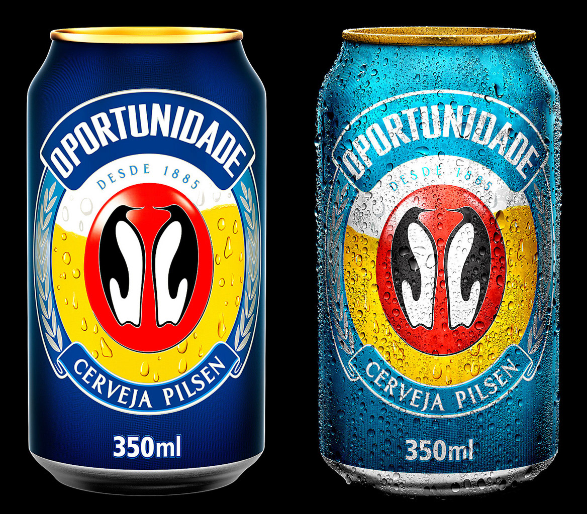
3) Eu redesenhei todos os rótulos. Imaginem um rótulo em tamanho normal feito para uma lata convencional!
Ok! Sabemos que este rótulo tem em torno de 15 cm a 300 dpi. Agora imaginem uma lata ilustrada e seu rótulo está proporcionalmente ampliado a quase 1 metro a 300 dpi.
Bom, agora percebem o GRANDE PROBLEMÃO que temos aqui. he he he he. Os arquivos de Photoshop beiraram quase 5 GB.
The big challenge was:
1) The final image was about one meter at 300 dpi, in pixels that gives almost 11.000 x 13.0000 pixels !!!
2) Because of the huge size and tight deadlines we decided to do the drops through Photoshop. Lucio Libanori took several pictures in high definition and re-designed drop by drop in Photoshop!
For each can, the drops were not different to the sides, top and bottom.
Why? Because all the cans have a special media cutter and thus maintain the same profit drops the same graphic media cutter also reducing the budget in general and the cost of print production.
That´s why there is also no drops in the ground, ice and other little stuffs...
For all the cans we had around five days to do, this period is very tight and very stressful then we had to find quick solutions to achieve a good quality.
3) I redesigned all labels. Imagine a full-size label made for a conventional can!
Ok! We know that this label has around 15 cm at 300 dpi. Now imagine an illustrated can and its label is proportionally enlarged to almost one meter to 300 dpi.
Well, now realize the BIG big problem we have here. he he he he. Photoshop files reach almost 5 GB each one.
Ok! We know that this label has around 15 cm at 300 dpi. Now imagine an illustrated can and its label is proportionally enlarged to almost one meter to 300 dpi.
Well, now realize the BIG big problem we have here. he he he he. Photoshop files reach almost 5 GB each one.
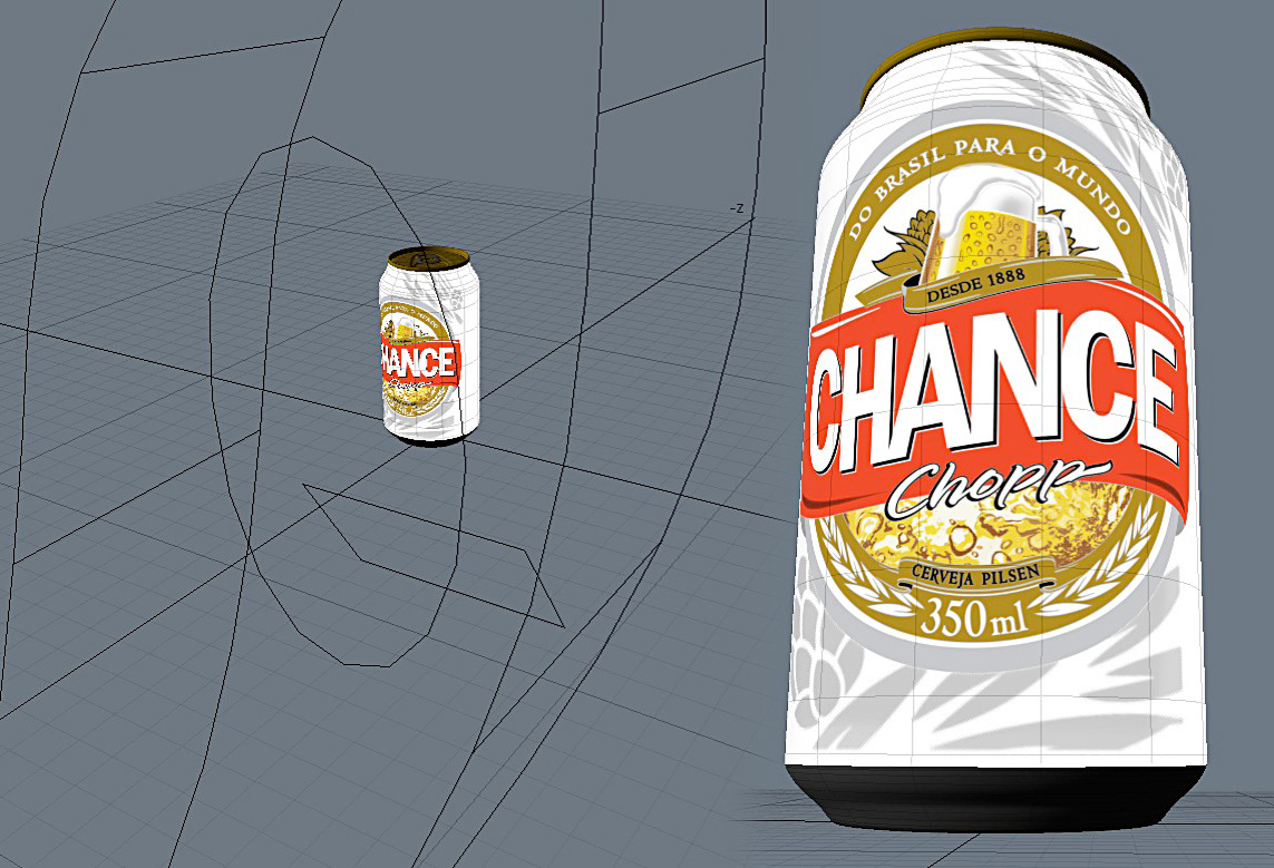
Como podem ver aqui nesta imagem, a iluminação é muito simples, simulamos um estúdio fotográfico com "hazes virtuais", são objetos modelados com fonte luminosa ou não apenas para marcar a luz na latinha.
As you can see here in this picture, the lighting is very simple, we simulate a photographic studio with "virtual hazies" objects was modeled with light source or not only to mark the light on the cans.
As you can see here in this picture, the lighting is very simple, we simulate a photographic studio with "virtual hazies" objects was modeled with light source or not only to mark the light on the cans.